
A+D Website Redesign
A full redesign of Bayer’s A+D product site, restructured around the only two pages parents used and rebuilt to hold the brand’s new photography and video.
Roles:
Lead Designer (sole designer on the project)
Collaboration:
RSD Marketing project manager
Bayer A+D brand team
Tongal (video and custom photography)
Tata Consultancy Services, TCS (development and production)
Platform:
Web, responsive
Deliverables:
SEO audit findings and website recommendations
Sitemap and wireframes
Style guide
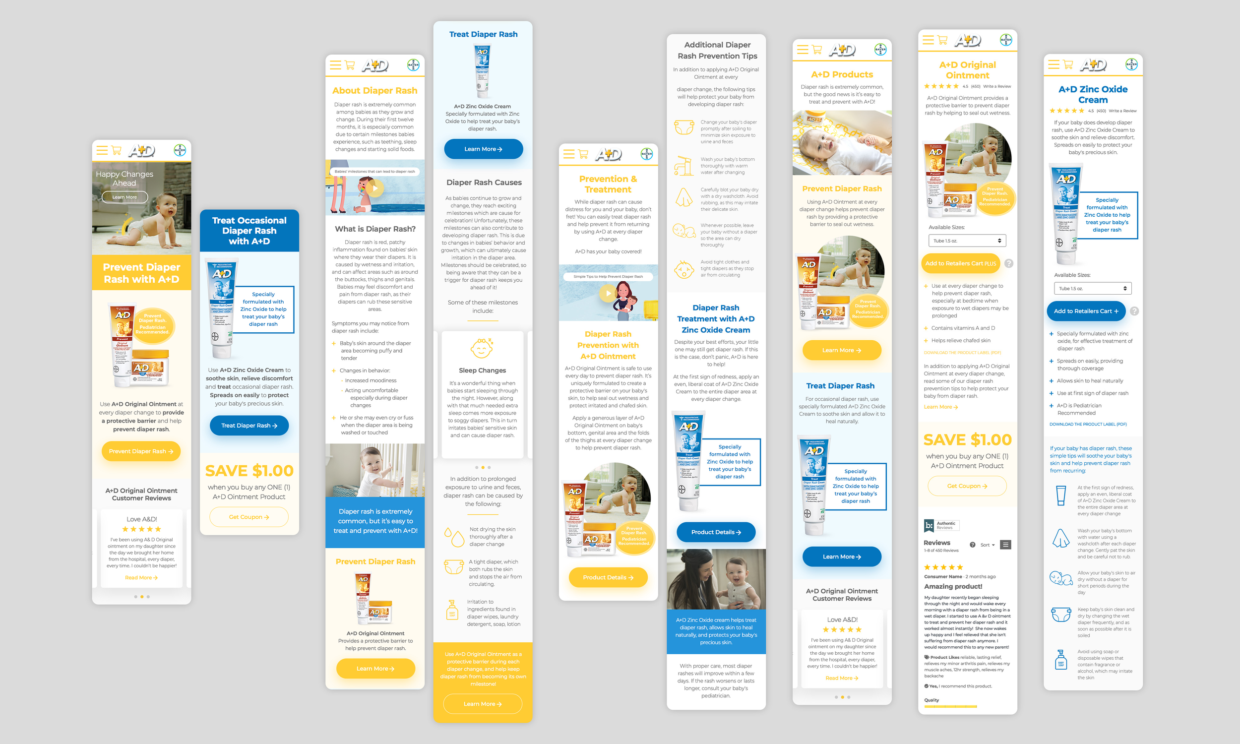
Responsive desktop and mobile design
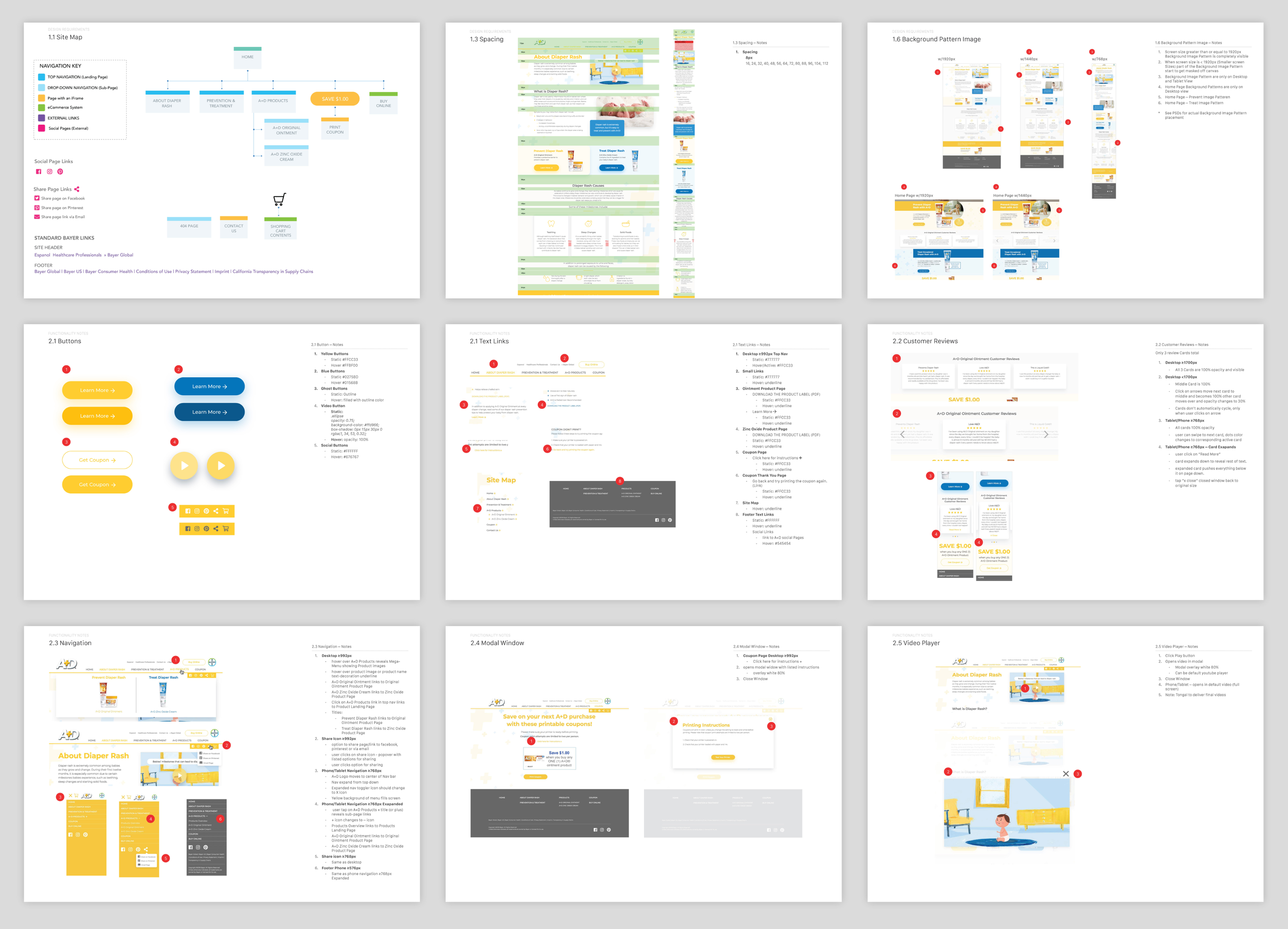
Developer notes and Zeplin handoff
Timeline:
8 Months
Responsibilities:
Ran the site and traffic audit with our project manager, then recommended a content strategy the client approved
Owned the sitemap, user flows, and wireframes end-to-end
Built a new visual language from the product packaging
Designed every layout, desktop and mobile
Presented to the client through every round
Led quality assurance through TCS development
OBJECTIVE
Parents have trusted A+D for diaper rash for decades. The site worked fine, but it was unfocused and clinical. It explained the products and other diaper rash information without considering anyone real.
Alongside the redesign, the brand team had commissioned new photography and video through Tongal, shot with real parents.
My job was to design something warm and inviting for a parent looking for help, and to give the new content a home.
Before I drew a screen, our project manager and I audited the site against 40 checks and pulled the traffic.
The technical side came back mostly clean. The traffic didn’t. Parents used 2 pages: the ointment page and the coupon page. Diapering Tips and the Diaper Bag Checklist pulled under 1% between them.
Process
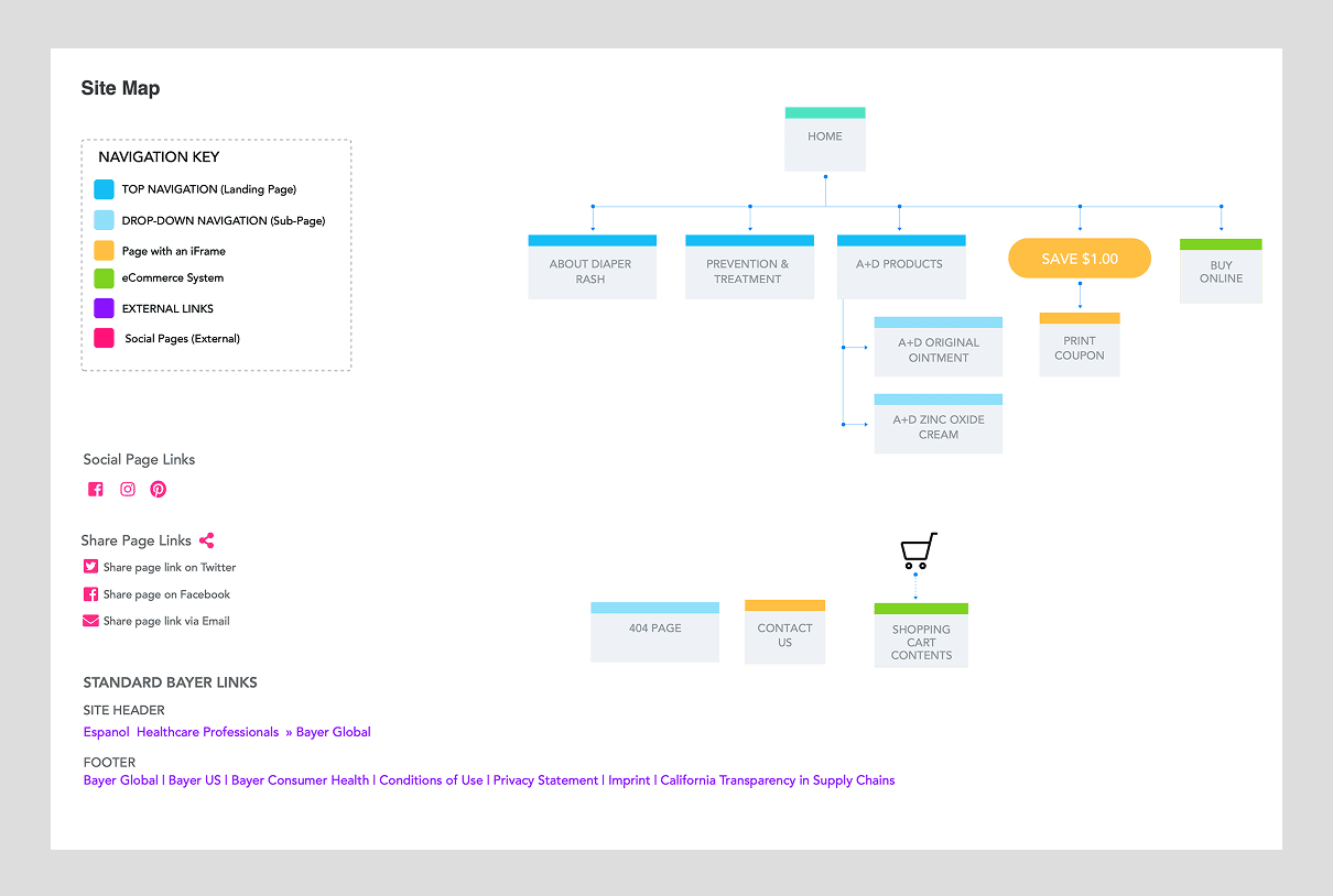
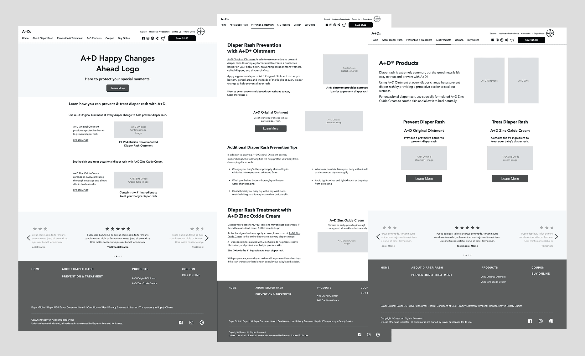
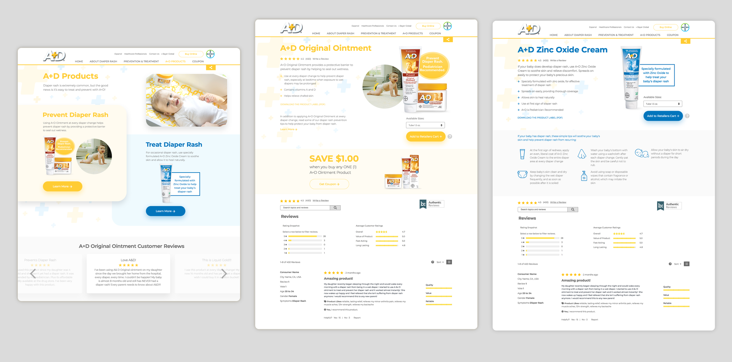
The ointment is A+D’s prevention product. You use it to keep a rash from starting. You reach for the zinc product once a baby has diaper rash. So the page parents came for, and the story Bayer wanted to tell, were already the same thing. The old site split them apart.
So my first recommendation was cutting. Both dead sections came out, and prevention ran as one story from the home page through.
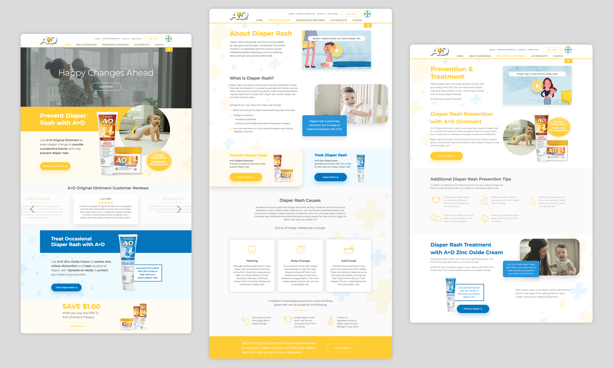
A+D sells 2 products. The prevention ointment in yellow, the zinc treatment in blue. That was the whole palette, already on the shelf.
Yellow led. Prevention was the story, and the ointment was the page parents came for, so I took the site’s color straight off the package.
I kept blue as the second color, so the treatment product stayed visible and the pages didn’t read like a pharmacy aisle.
Then the plus sign. It’s already in the A+D logo, so I pulled it out and turned it into a background pattern. It gave flat sections some texture and put the brand into the layout itself. It’s a small move, and it holds the pages together.
Design
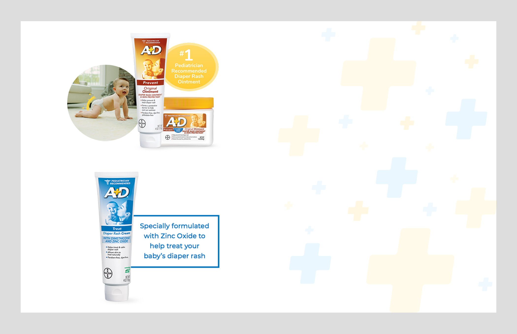
The plus pattern is behind both products. Yellow for prevention, blue for treatment.
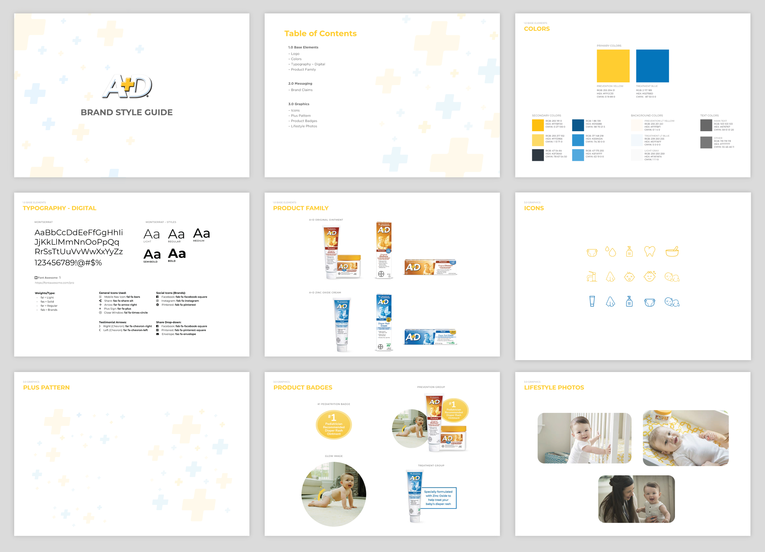
I built all of it into a full style guide. Color, typography, a custom icon set, product badges, rules for the plus pattern, and direction for how to use Tongal’s lifestyle photography.
That was deliberate. I answer as much as I can in the handoff so nobody has to wait on a reply. TCS was building off my files, and anything I left to interpretation was going to come back interpreted.
Style Guide
The coupon was the second thing parents came for, so I put it on every page, easy to get to without getting in the way. When you click it, a modal opens with printing instructions.
Final Designs – Desktop
Final Designs – Mobile
HANDOFF: Development Notes and Requirements
RESULTS
The site launched. The client was happy with the work and the final design. That’s where the story ends, and it bothers me.
I never got post-launch numbers. I didn’t have a direct line to ask the client for them, and nothing came back through the agency. 8 months of work, an audit that handed me a clean baseline to measure against, and I still can’t tell you whether one parent found what they needed faster than before.
Next time I’d put the numbers in the handoff. Name them in the recommendations deck up front, agree on who pulls them and when, and put a check-in on the calendar before the project closes.