
Ascensia U.S. BGM Consumer & Healthcare Professionals (HCPs) SITE REDESIGN
A redesign of Ascensia’s U.S. blood glucose monitoring site, rebuilt to put product benefits up front and move people toward buying, without stepping outside a global CMS template.
Roles:
Lead Designer, UX, UI
Collaboration:
RSD Marketing project manager
Ascensia Diabetes U.S. BGM Marketing Team
Rightpoint (development and production)
Platform:
Web, responsive
Deliverables:
Responsive consumer and HCP page designs adapted from the global template
A restructured HCP site section with its own navigation
Custom digital graphics built from the brand’s test-strip campaign
Recommended HCP sample-ordering flows
Image sourcing and visual direction
Developer notes and Zeplin handoff
Timeline:
6 Months
Responsibilities:
Redesigned page layouts using only the existing CMS components and base styles
Reordered content so product information and the reasons to buy came up earlier on the page
Found the HCP routing problem, raised it, and built HCPs their own site section
Designed the HCP pages against the updated consumer template
Mapped the HCP sample-ordering paths and recommended new flows
Led every client presentation with our PM. The client asked for me from the start, after earlier projects together
OBJECTIVE
Global development built one layout template for every country site. Same components, same base styles, same structure underneath.
The U.S. BGM team looked at it and saw a selling problem. Product information sat too far down the page, and the calls to action didn’t carry any weight once you got there.
They couldn’t ask for a different site. The template was going out everywhere, and I had to build anything I designed out of parts that already existed. So the job was to make the U.S. pages work harder without pulling them out of the global system.
Evolution of layout

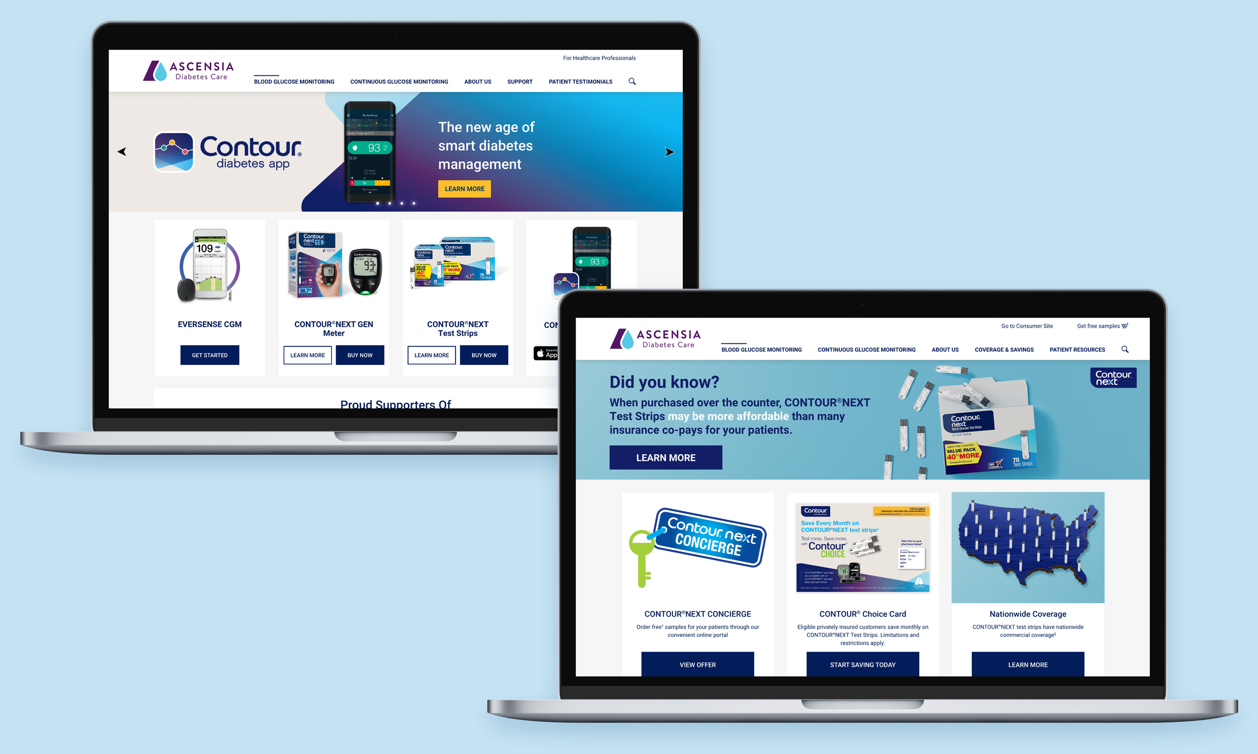
I had the existing components and base styles and nothing else. So all I could change was order and emphasis. I moved product and the reasons to buy ahead of the brand story, and gave the CTAs enough space and contrast to read as the next step.
The judgment call was how far to push. I could reorder sections and change what a component carried without breaking the rules. Rebuilding page structure would have broken them. I held that line, which is why the U.S. pages look different from every other country’s and still run on the same build.
Even once the layouts held, the pages still read like a system diagram. I sourced lifestyle photography through Adobe Stock to put actual people on a site about managing diabetes.
PROCESS
The brand team brought me the two problems they already knew about: buried product information and weak CTAs. Both started at the top of the page. The template opened with brand-level content and pushed the meter, the strips, and the reason to buy below where anyone shopping would scroll.
Final designs for consumer site


HCP SITE
The site kept routing healthcare professionals into consumer pages.
There wasn’t an HCP site, just HCP content threaded through a consumer path.
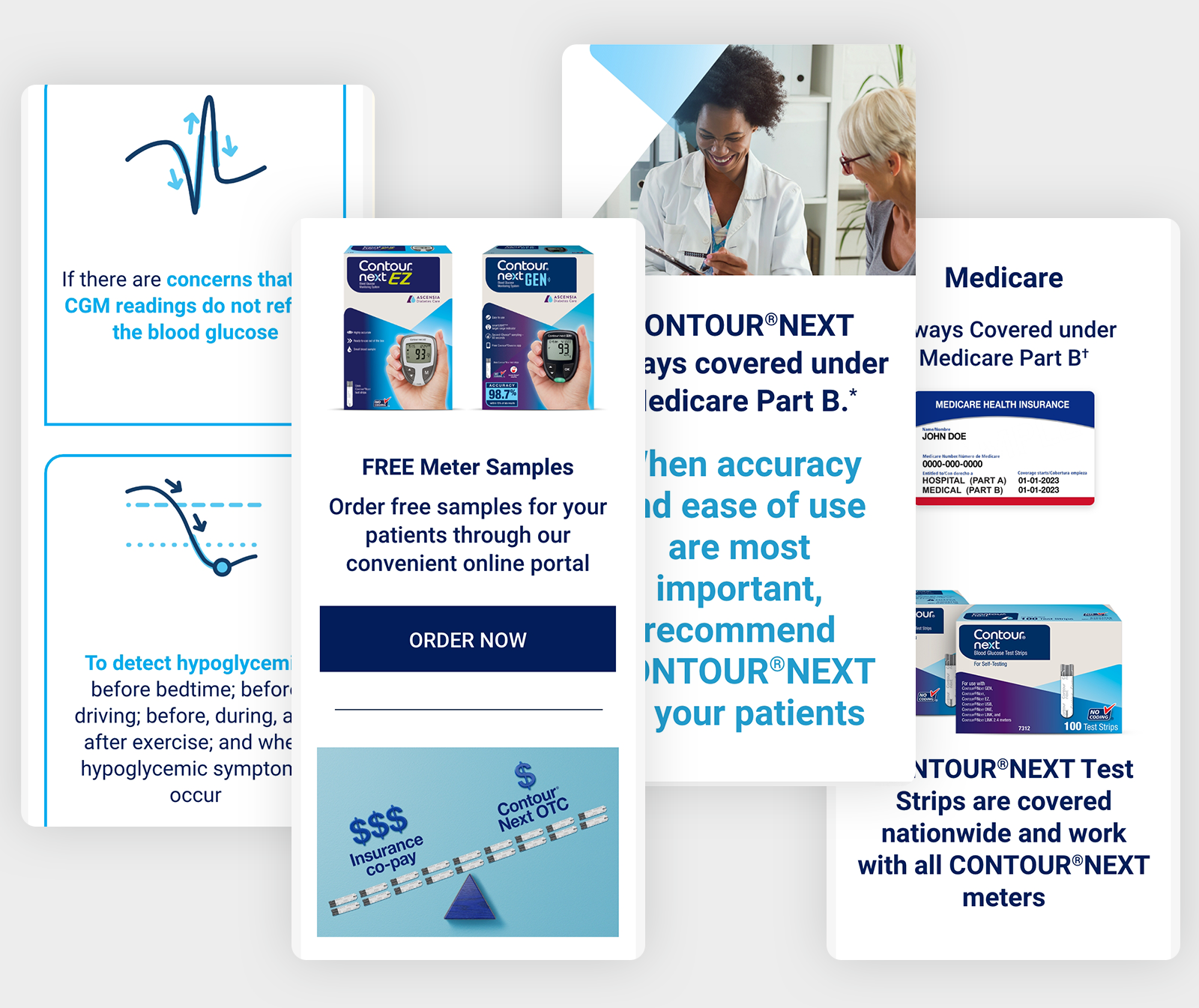
I raised it with the client. New pages were already in the works, so I asked them to name the top-level sections and the full page list before I designed anything. They came back with a sitemap, and I built from it: navigation that kept HCPs on HCP pages, and pages designed on the updated consumer template. The custom graphics came from the brand’s test-strip campaign, so the HCP pages matched what people were already seeing.

Final designs for HCP site
One more thing turned up while I was reviewing the site. The “Order Samples” link in the HCP section didn’t order anything. It handed HCPs off to CONTOUR®NEXT Concierge, a separate site, where signup and login buried the ordering under enough screens that they were dropping off before they got through it.
I brought it to the client, and they asked to see recommendations. So I mapped both existing paths, with an account and without, then drew a flow for each that took steps and screens out of the middle.
Recommended user flow for HCPs ordering product samples
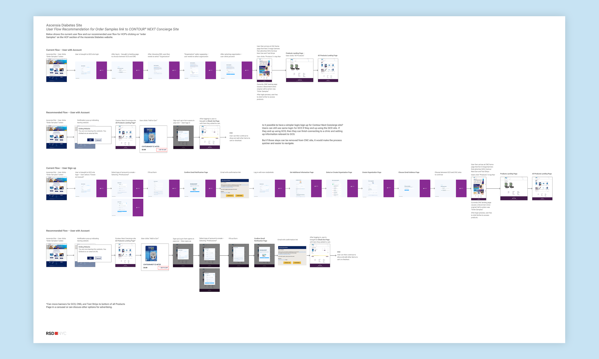
Current and recommended paths from the “Order Samples” link to the CONTOUR®NEXT Concierge site, for HCPs with and without an account.
Development production notes in Zeplin
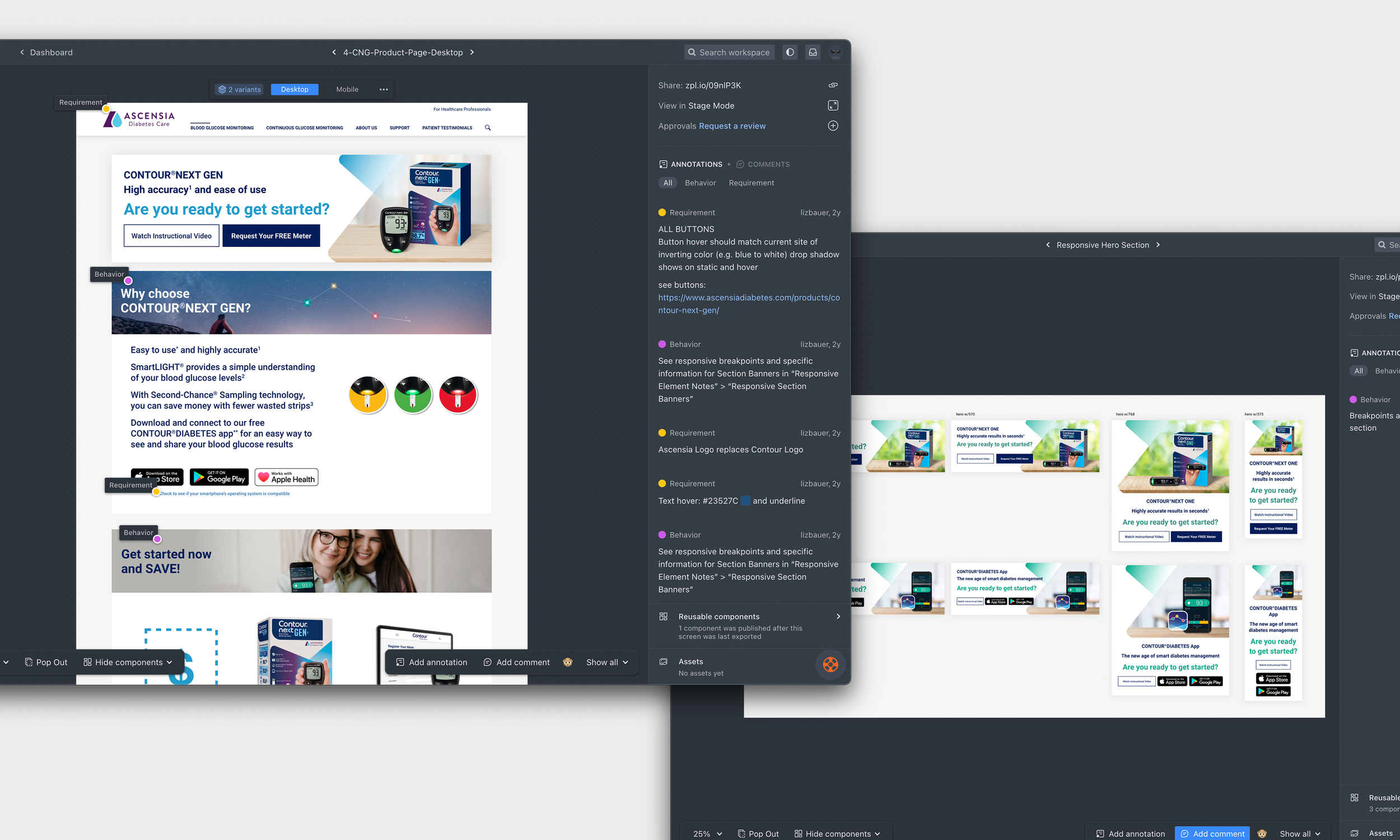
Rightpoint built from Zeplin and my design files, so the notes had to answer questions before anyone thought to ask them.
RESULTS
The redesign launched. The U.S. pages lead with product now, and they still run on the global build, which was the assignment. Ascensia also took the sample-ordering recommendation and built it.
No post-launch numbers came back to me, so I can’t tell you whether the reordered pages moved a single person closer to buying a meter.
WHAT I LEARNED
I’d spent time with the global development team on another project and understood their reasoning behind the template too well. My first round of designs sat so far inside the CMS structure that they didn’t push on what the U.S. team was asking for.
It took people on my own team to say the pages needed lifestyle photography and more personality. They were right, and that change made the work land.
I let the code decide the design for me. Now I push a design a lot further, and I still know what will hold.