
GLUCOCONTRO.Online – Global Software Launch Campaign
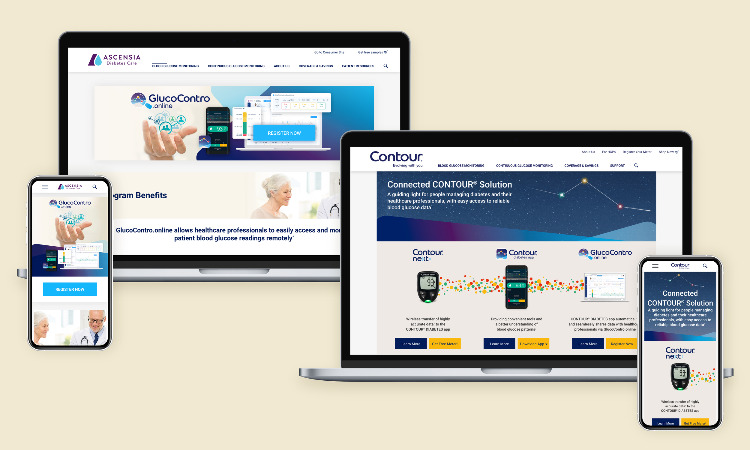
A 15-month, 3-phase global campaign introducing software that lets doctors see their patients’ blood glucose readings remotely, designed once and rebuilt across international markets from one set of localization kits.
Roles:
Lead Designer (sole designer on the project): UX, UI, Asset Management
Collaboration:
RSD Marketing project manager
Ascensia Diabetes Care global brand team
Rightpoint (development and production)
Platform:
Web, responsive, and email
Deliverables:
Global landing page introducing Glucocontro.online
U.S. healthcare professional landing page and recruitment email
Global Connected CONTOUR® Solution landing page and homepage banner
2 healthcare professional email newsletters and 1 patient newsletter, built in ClickDimensions
Localization kits: product imagery, translation templates, development notes
Annotated design PDFs for global legal review
Zeplin handoff and developer documentation
Timeline:
15 Months across 3 phases
Responsibilities:
Owned UX and UI across all 3 phases, from content structure through production, as the only designer on the project
Set digital art direction with no brand document or design system to work from, and derived the visual language from the live site and existing print materials
Restructured content mid-project when global development replaced the site template
Presented layout directions to the global brand team with a recommendation, and persuaded them to take it
Built localization kits, including translation templates, so Rightpoint could rebuild each page for every market
Ran handoff and cross-browser QA with Rightpoint
OBJECTIVE
Ascensia built software that lets a doctor pull up a patient's blood glucose readings without the patient sitting in front of them. It only works if 3 things line up: the patient uses an Ascensia meter, logs readings through the CONTOUR®Diabetes app, and the doctor registers for the Glucocontro.online portal.
The system was disjointed. A patient downloaded an app, a doctor logged into a dashboard, and neither one could see what connected the two.
The global team planned the rollout in phases: patients first, then U.S. doctors, then both audiences at once with all 3 products presented as a single solution. I led design across all of it.
Phase 1 – Global landing page onboarding patients (3 Months)
A doctor's dashboard stays empty unless the patient is logging readings in the CONTOUR®Diabetes app, so app downloads were the target, even though the page was about the portal.
Global landing page template, consumer audience
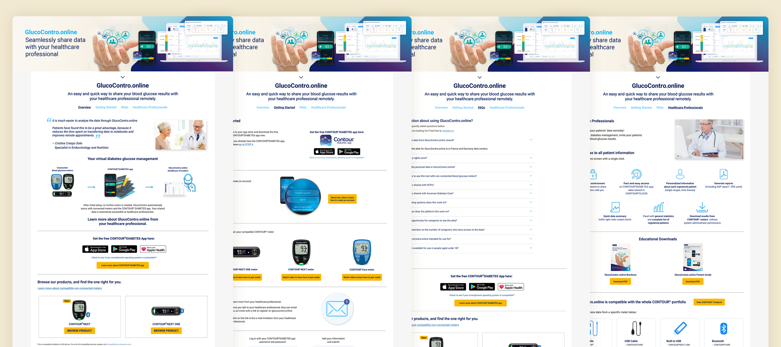
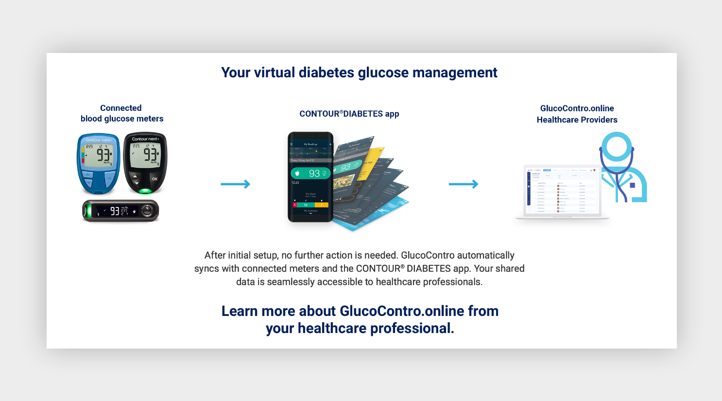
I rebuilt the content structure around the connection rather than the software, then drew the connection itself as an infographic. App call-outs run through the page instead of sitting once at the bottom.
There was no brand document and no design system. The visual language was scattered across the live site and the printed brochures, so I pulled type, color, and spacing values off the live pages with browser plugins and matched the rest to the print pieces. Every layout I designed after that looked like the brand and matched something the CMS could already build.
The page then went through 3 rounds of revision and legal, medical, and regulatory review, like any piece of pharma marketing.
Meter to app to portal to doctor, the part of the system neither audience could see.
Phase 2 – U.S. Healthcare Professional Onboarding (4 Months)
Doctors needed one place to understand the software, register, and learn how to set up their dashboard.
During this phase, the global development team was updating the site layout template. They were replacing the tabbed structure from Phase 1 with a single long scrolling page with section headlines, and the components weren't finished yet.
I worked with the development team through the rebuild and restructured the content to read top to bottom. Tabs let a doctor skip straight to registration and a scroll doesn't, so I made the order carry it: what it is, why it matters, how to register, how to set up the dashboard, each anchored by its own headline.
U.S. healthcare professional landing page

Healthcare professional recruitment email

For the announcement email, the client sent a content document and I designed it from the landing page's elements, so a doctor who clicked through landed somewhere familiar. I built it in ClickDimensions.
Phase 3 – Connected Contour Solution (8 Months)
The global brand team changed the story. Instead of promoting Glucocontro.online on its own, they wanted to present the meter, the CONTOUR®Diabetes app, and the portal as one connected system, to patients and doctors at the same time, in every market.
Their brief asked for two things that couldn't both be true. As simple as possible, ideally visible without scrolling. Also: benefits, embedded animations, future partnerships, and separate calls to action for all 3 products.
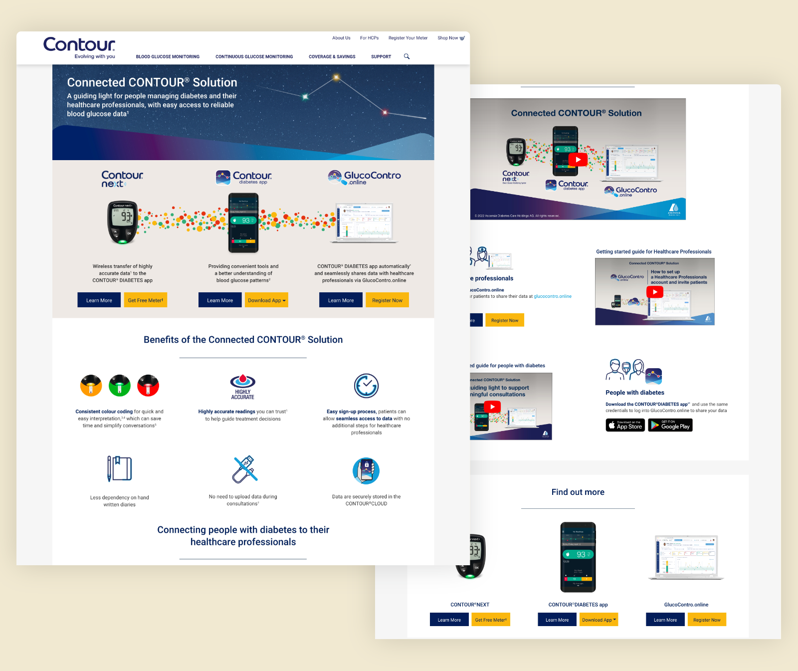
Three directions presented to the global brand team. A and B keep the detailed benefits section. C is the version the brief asked for.
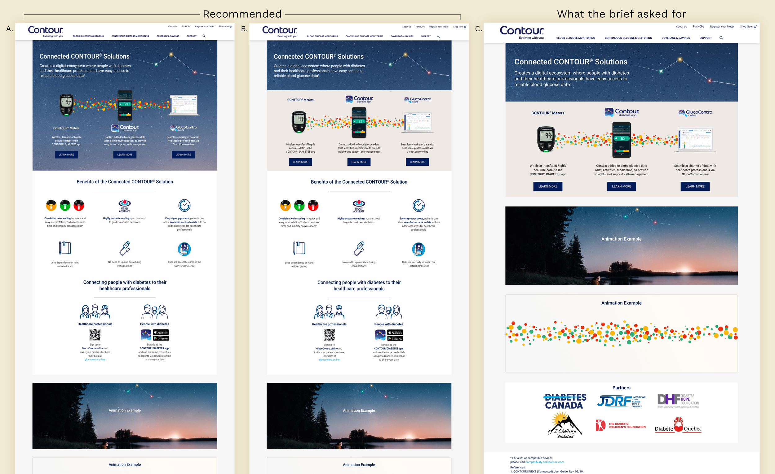
I recommended A or B. The page exists to show how 3 products work together, and a hero can state that, but it can't demonstrate it. Cutting the benefits section to save a scroll would have removed the only part that showed what the program solves. They went with the longer page.
Final global landing page.
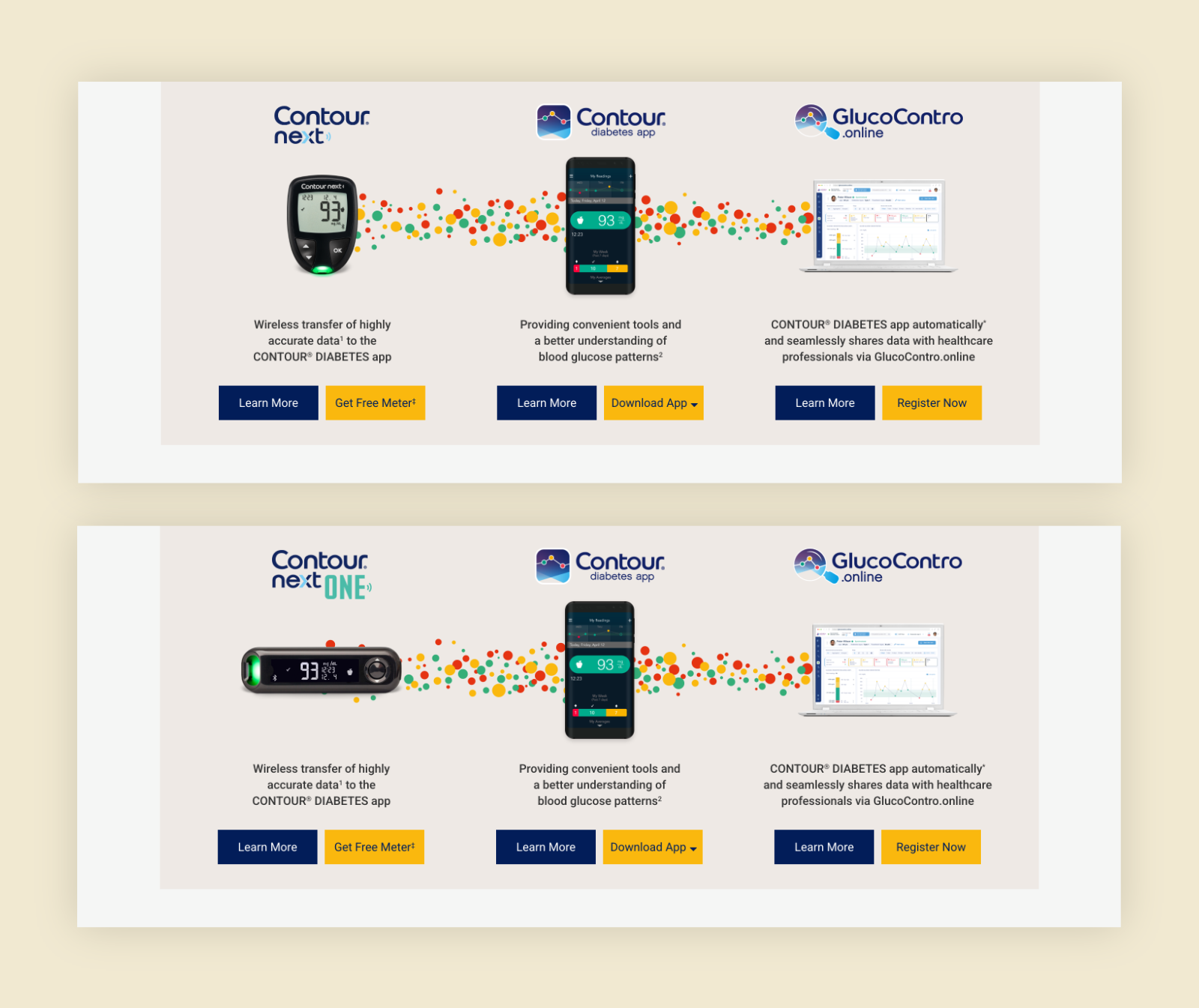
The infographic shows a meter, and not every country sells the same one. Most use CONTOUR NEXT, ELITE, CARE, or BLUE, all vertical. CONTOUR PLUS ONE is horizontal, and dropping it into a layout built around vertical proportions broke the dot pattern behind it. I flagged it and built a second infographic layout for horizontal meters, so nobody had to improvise a fix.
Two infographic layouts so every market had one that fit its meter.
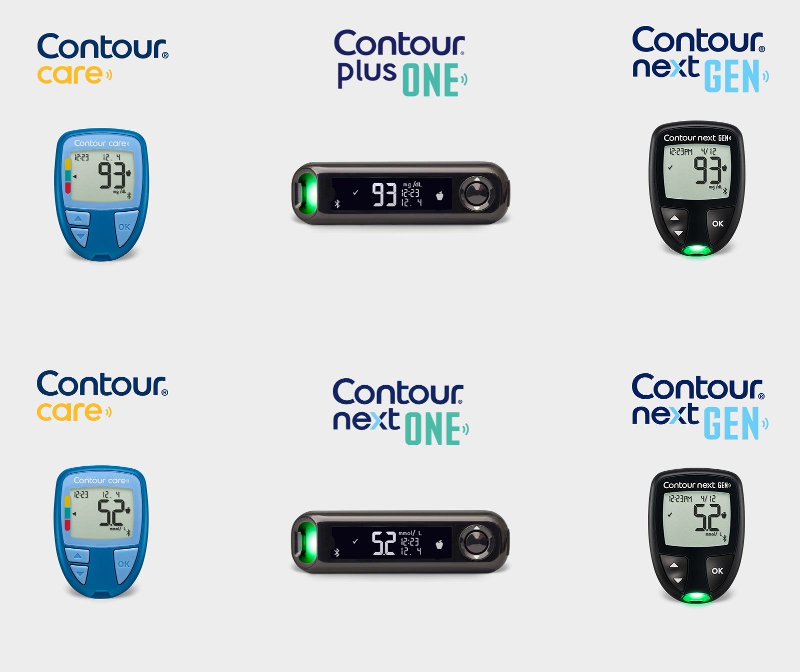
Meters with different measurements depending on country site.
The global team also wanted an email template they could update and send themselves to promote the Connected CONTOUR® Solution.
Email layout for global distribution.

PRODUCTION + HANDOFF
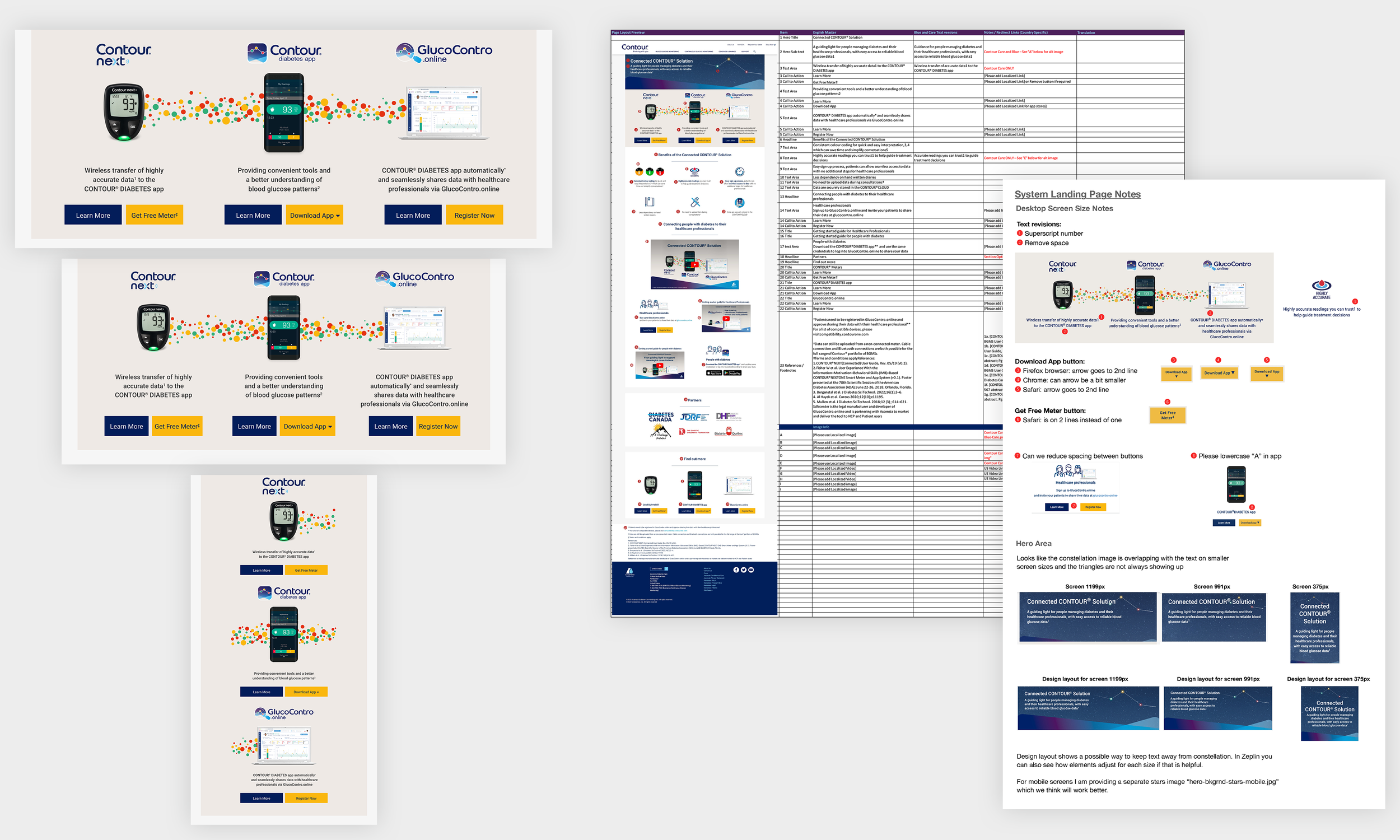
Rightpoint built from Zeplin and my files, then rebuilt each country version from the localization kit, dropping in copy from a separate translation team. I wrote the documentation to answer things before anyone thought to ask: responsive breakdowns for the connected solutions graphic, image specs and measurements per market, content and development notes, and a translation template I extended with every phase.
Production assets and localization documentation.
RESULTS
All 3 phases launched, and Rightpoint rolled the templates out across country sites with almost no friction.
I don't have post-launch numbers. No download figures, no registration counts, nothing that tells me whether one more doctor saw one more patient's readings because of this.
The process kept working without me. Somewhere in Phase 1 the instructions for rebuilding the page became the deliverable, and I designed everything after that for the handoff.
NEXT PROJECT