
ConNext Ed – Pharmacy Education App
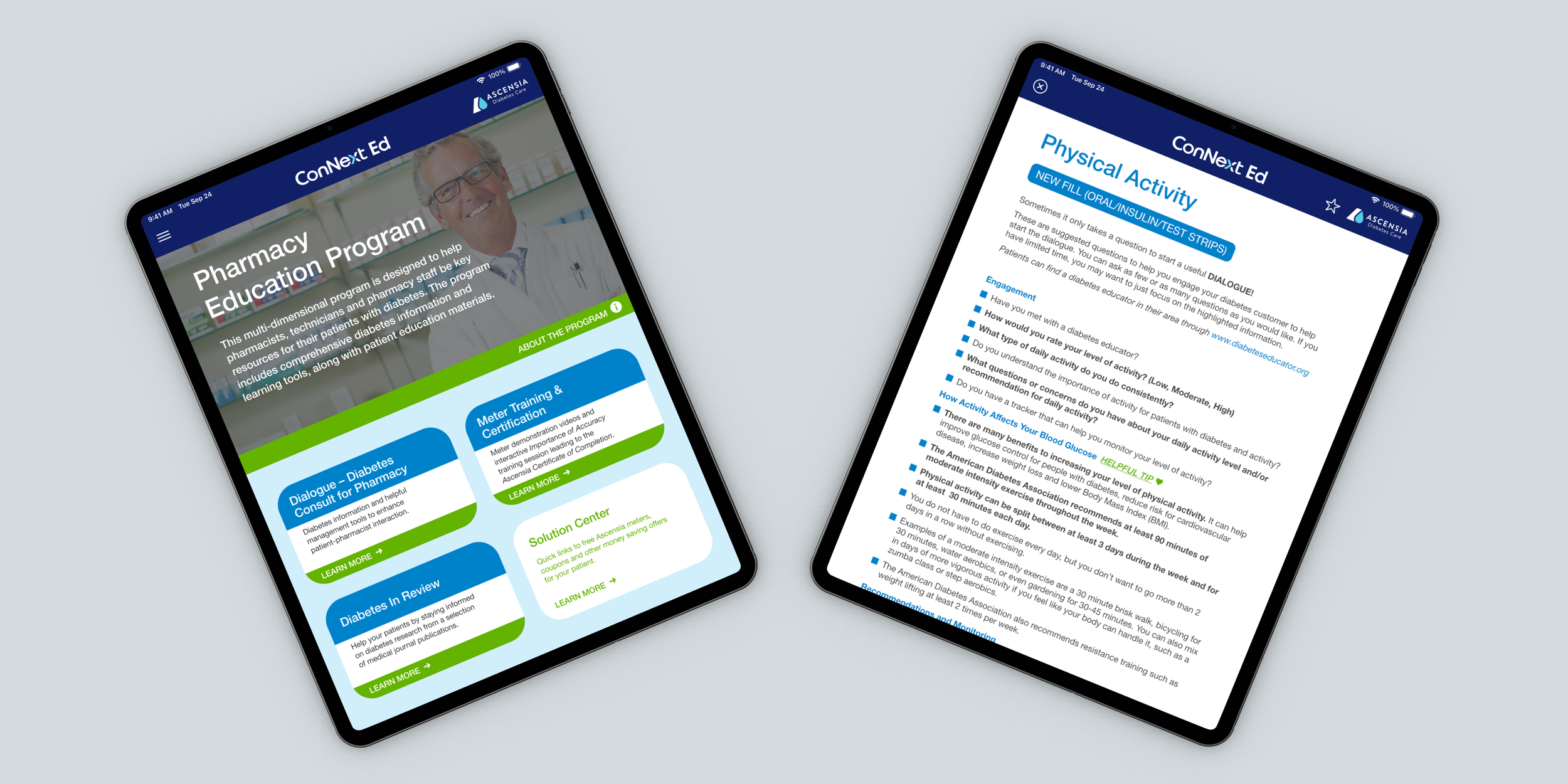
An app that gives pharmacists the resources and consultation scripts they need to help patients who are managing diabetes, right at the counter.
Roles:
Product Designer, Project & Production Management
Collaboration:
RSD Marketing leadership (President and VP)
RSD Marketing Development Director
App Developer
Senior Designer
Ascensia Diabetes Care project and development teams
Platform:
Ionic, shipped to both the Apple App Store and Google Play from one codebase
Deliverables:
Wireframes, user flows
Project status deck
The app design template
App prototype, a click-through demo presented to the client
Timeline:
6 Months
Responsibilities:
Owned the user flows and wireframes start to finish
Designed the screens the client approved, then directed a senior designer who built out the remaining pages from the design template
Ran client presentations
Managed timeline and status across the agency and Ascensia teams
Led quality assurance through development
OBJECTIVE
The original content lived in a bulky binder, hard to search on the spot while a pharmacist was mid-conversation with a patient.
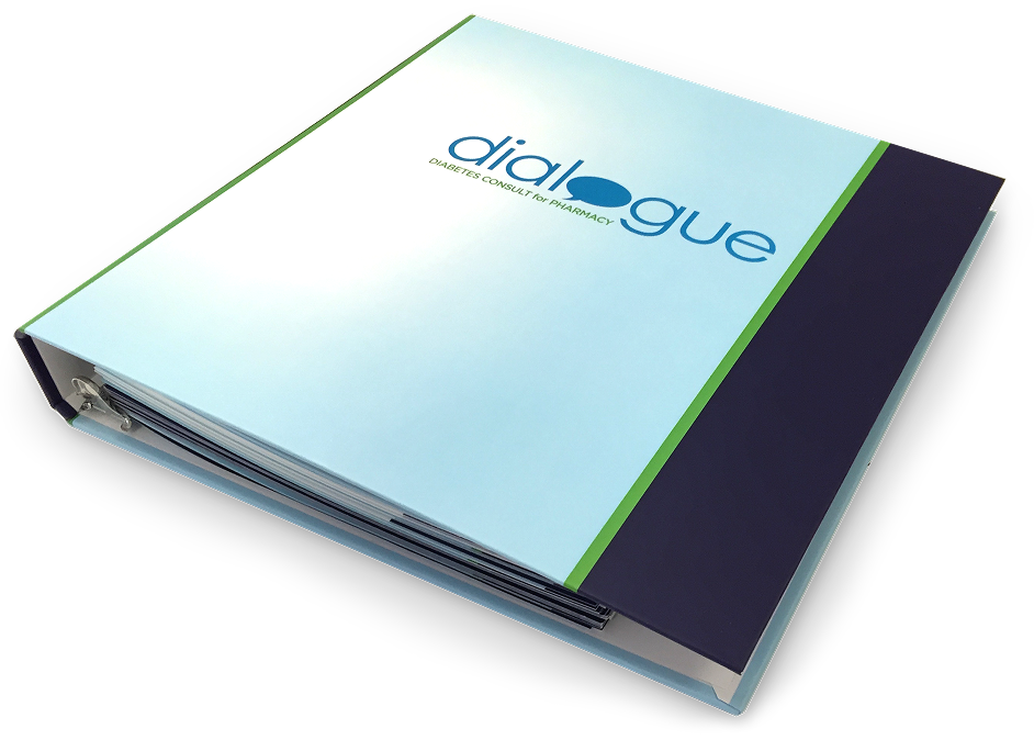
The ask: turn that binder into a tablet app pharmacists could use at the counter. The catch: budget meant a literal translation, not a redesign. Same content, same structure, just on a screen.
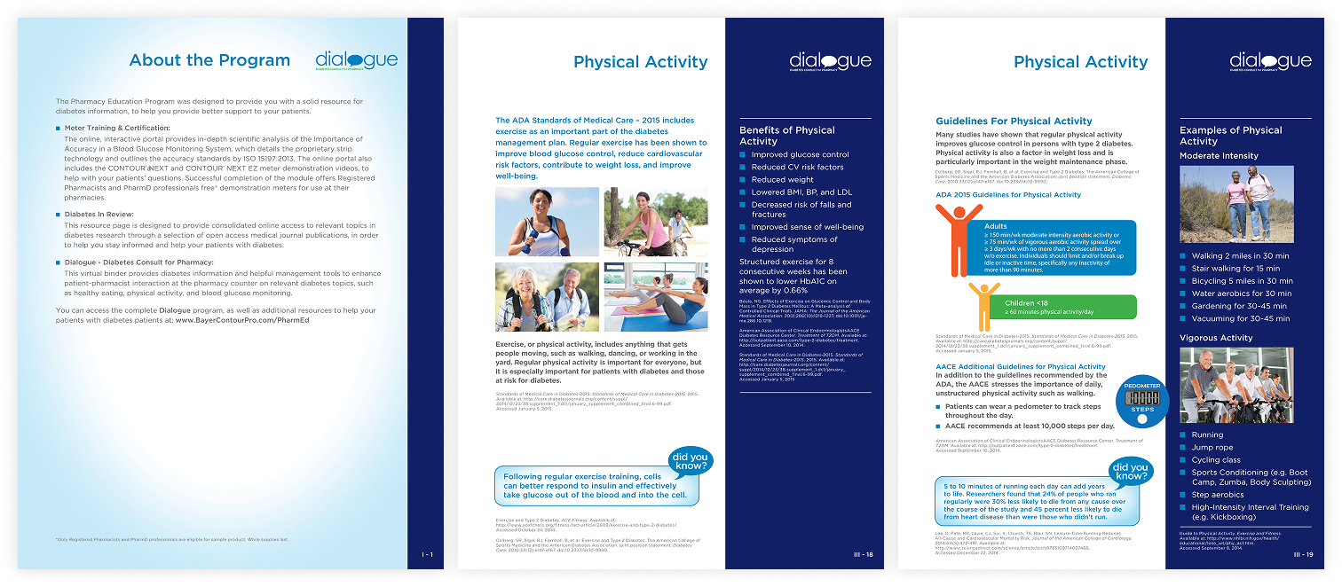
Our agency had designed the original binder, so I already had every file and asset available. That saved real time. The hard part was making dense, clinical content survive the jump from a flat printed page to a vertical, tap-through screen that was easy to navigate.
Process
I started by mapping the binder page by page: what was actually a distinct topic, what was just formatting, and where content could collapse into fewer taps.
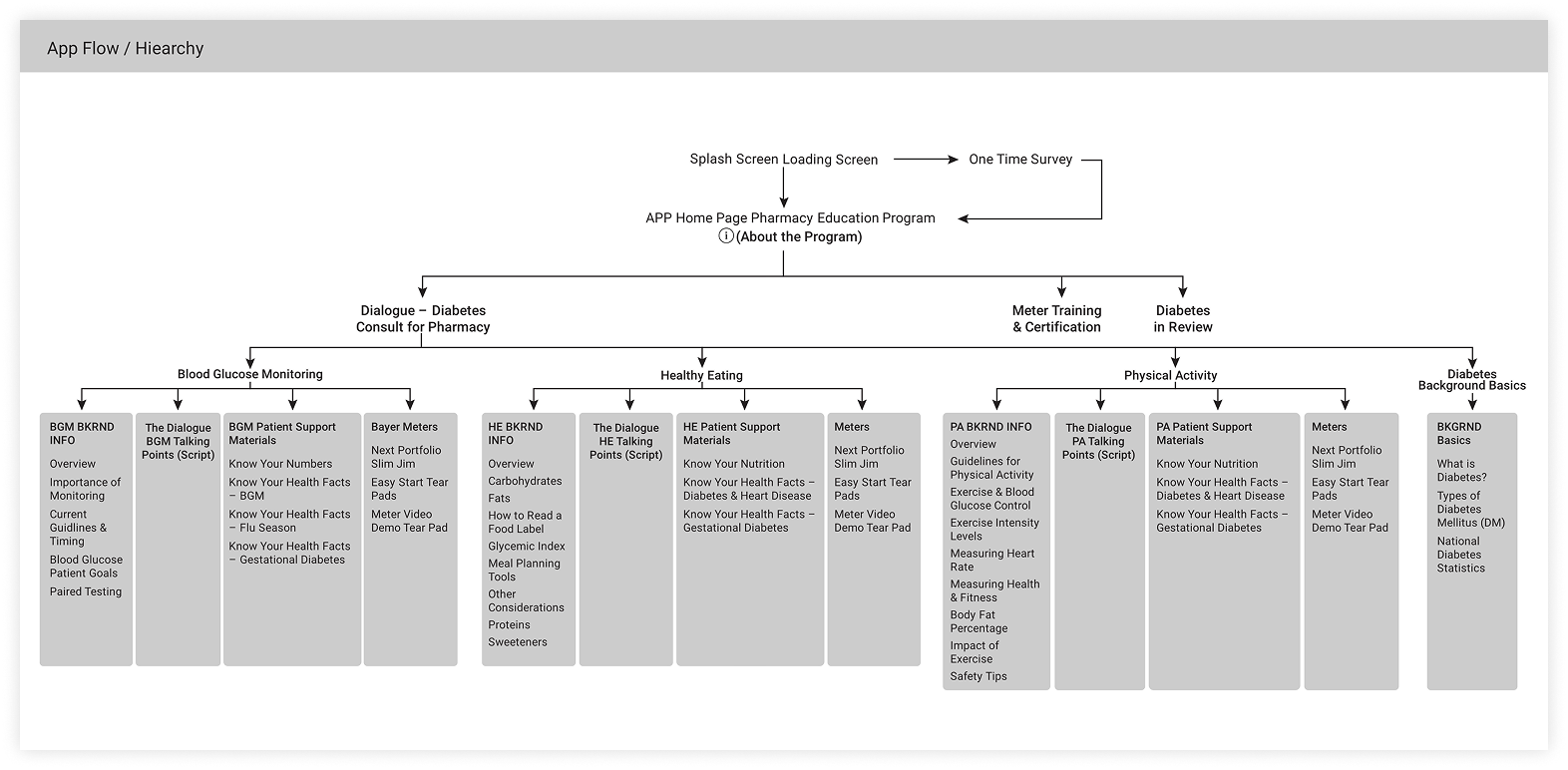
“About the Program” is a good example. In the binder, it was its own page. In the app, it became a dropdown right on the home screen. One less page to navigate, same information.
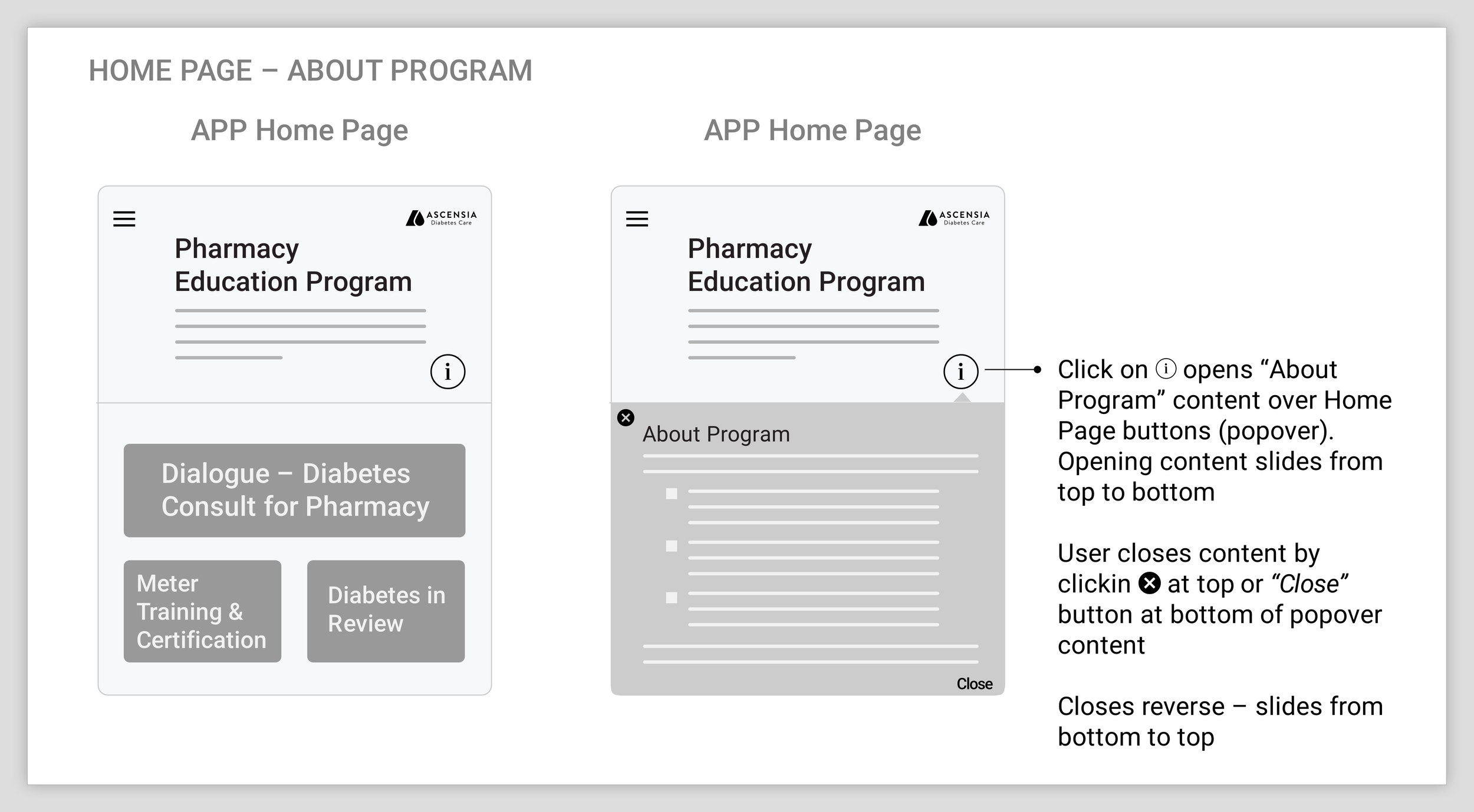
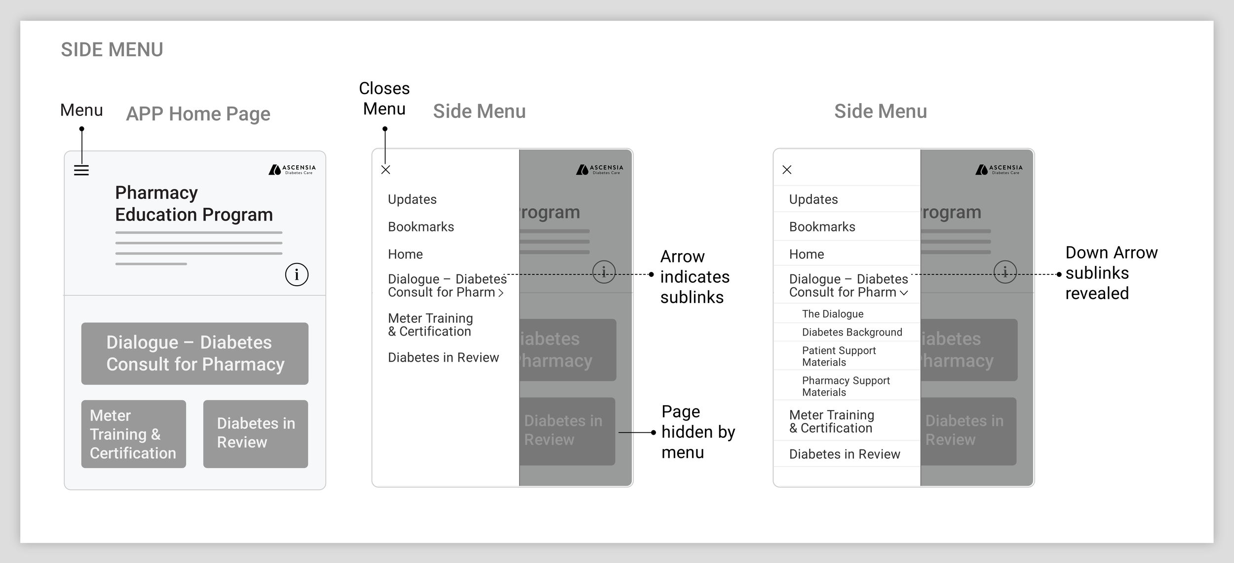
Pharmacists could reach any section by tapping a button on the landing page, or jump straight to one from the side menu.
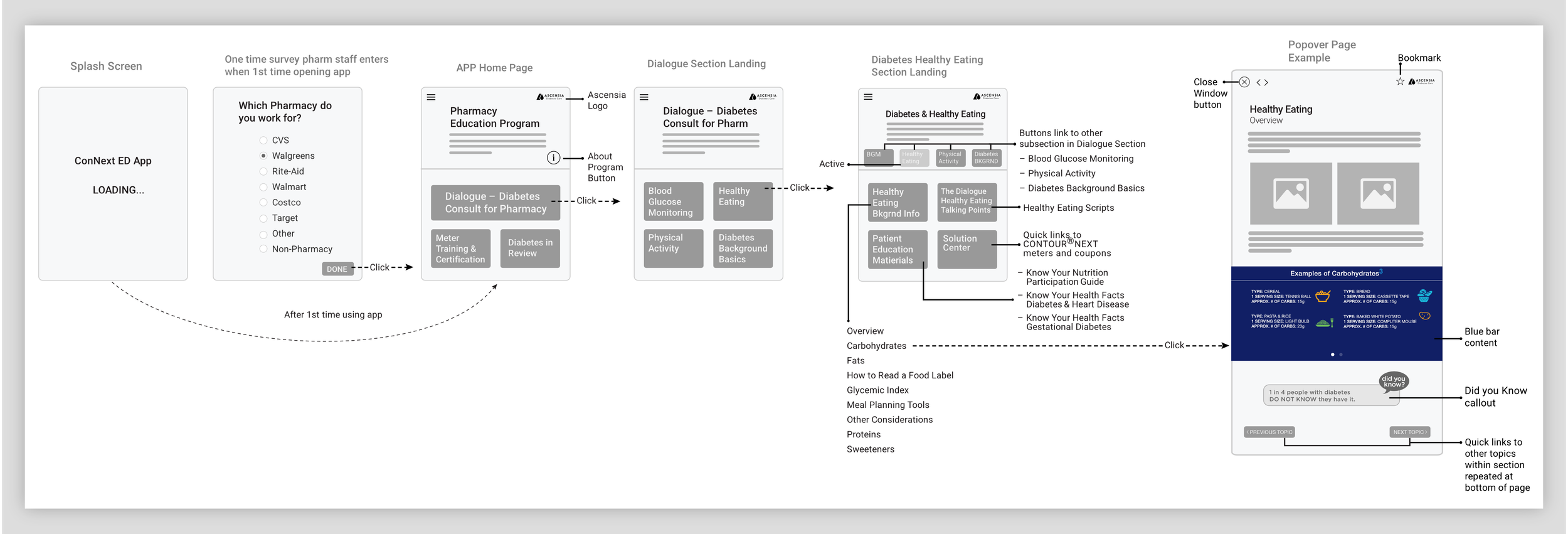
Each section had its own landing page. Tapping a topic button launched a page that slides in from bottom to top.
Design
I built the layout vertically. Text-heavy content needs a bigger reading area, which means fewer scrolls, and the client agreed.
Design decisions:
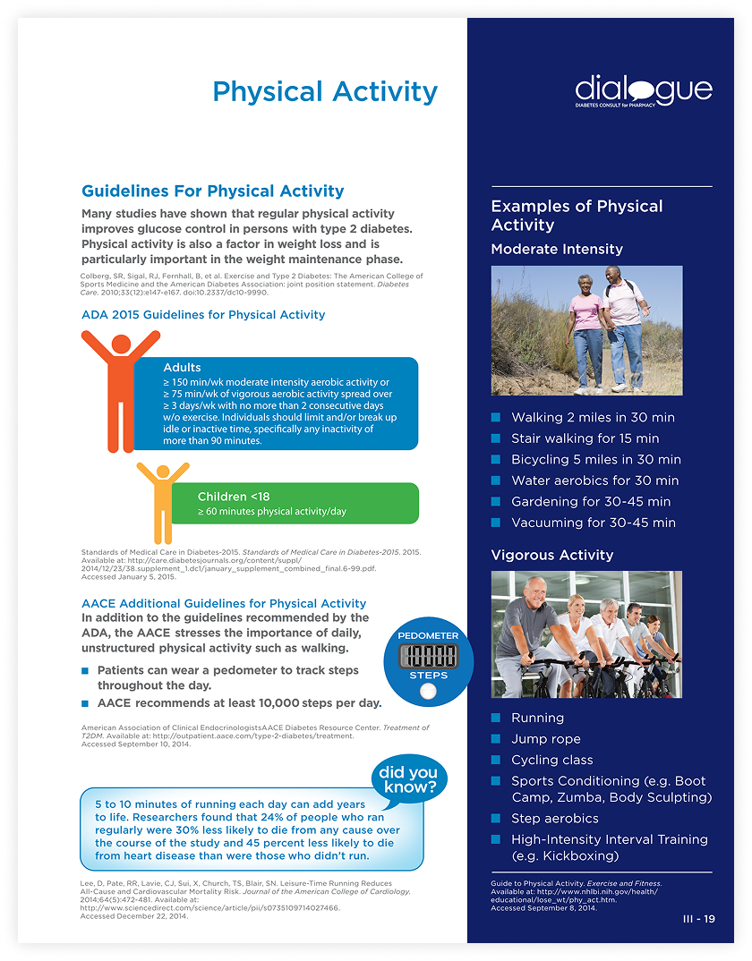
The binder’s side blue bar became a swipeable callout in the middle of the page.
Bullet blocks shifted from blue to orange for better contrast.
Tooltips replaced footnotes for references and “Helpful Tips.”
Dropped the gradient behind the “Did You Know” callouts, since it was fighting the text instead of framing it.
I also added a “Quick Access” section that didn’t exist in the binder, a shortcut to the content I thought pharmacists would reach for most.
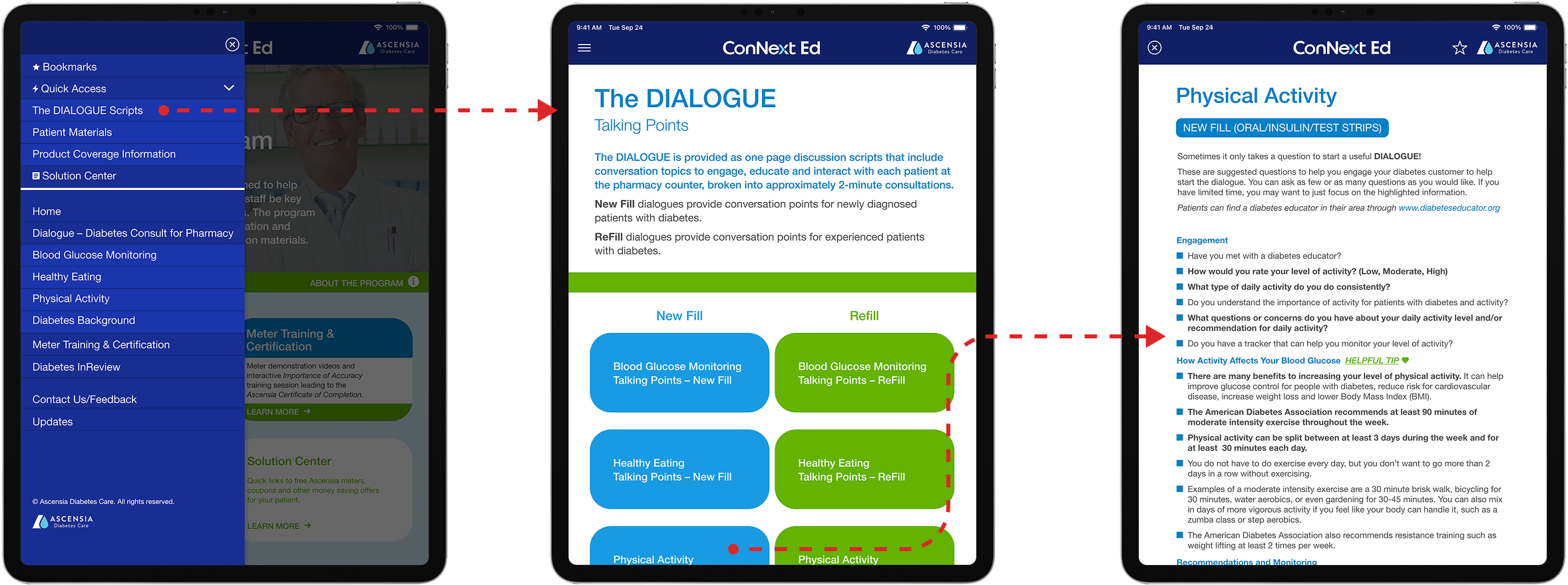
For the deeper background pages, tapping a topic slides a new page up over the current screen. Pharmacists move forward and back within the section using the buttons at the bottom of the page or the arrows in the top bar. To get back to the section landing page, they close out from the top left.
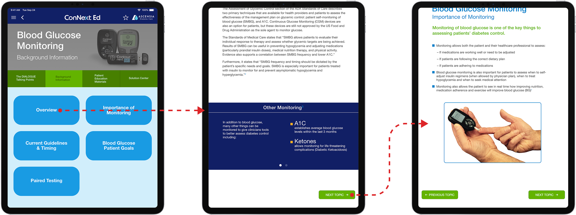
“The Dialogue” was the feature the client cared about most: one-page, 2-minute consultation scripts for pharmacists to use right at the counter. Every topic ships with two versions, one for a patient newly diagnosed, one for someone who’s been managing diabetes for years. That’s the part of the binder that actually mattered, so I made sure it survived the translation intact.
Results
The app shipped to the App Store and Google Play, then quietly didn’t stick. Pharmacists don’t have time mid-shift to read dense content, no matter how well it’s organized. A literal translation solved the wrong problem: the binder crammed everything into one place, and putting it on a screen carried all of it over.
WHAT I’D DO DIFFERENTLY
Looking back, I’d have pushed harder to cut content rather than only reorganize it, keeping the consultation scripts, the meter videos, and the path to free samples. I did raise the amount of content with agency leadership at the time. But the client had already locked in a literal translation because of budget, and I never had a direct line to make that case to them myself.
The deeper diabetes education material deserves its own app, for patients who want a trusted source to learn from directly. Bundling it into a tool built for a pharmacist with no time to spare buried it.
The app didn’t do what I wanted it to do. I ran it from binder to build, across agency leadership, a development team, and a healthcare client. That’s where I learned to manage scope.